
America as an Ideal
I never planned to become an artist. I studied graphic design, which was very different than a degree in fine art. I didn’t understand why fine art mattered. I thought commercial art was practical because of its utility. By my late 30s, I wasn’t sure graphic design made sense for me. I was ready to give up on the arts, and then I decided to go to business school.
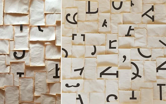
Much to my surprise, business school turned me into even more of an artist. So much so, that upon graduation, I layered a fine art practice in addition to remaining a graphic designer, and taught myself how to paint. A few years after business school, life dealt me an unknown health challenge that ultimately became a gift in an odd package. My health journey took seven years to diagnose, and in the beginning I was terrified. In the absence of information, the mind meanders through dark alleys. I decided then that if my life were to change dramatically, that I wanted to leave my art as an offering. Perhaps it sounds dramatic, but when the vessel shows signs of betrayal, you do a lot of future-forecasting. At least I did. That’s when I found myself inside my local art store, standing in front of a 36” x 36” wood panel. I took it home and eventually to my studio. I had never made a piece of art that big.
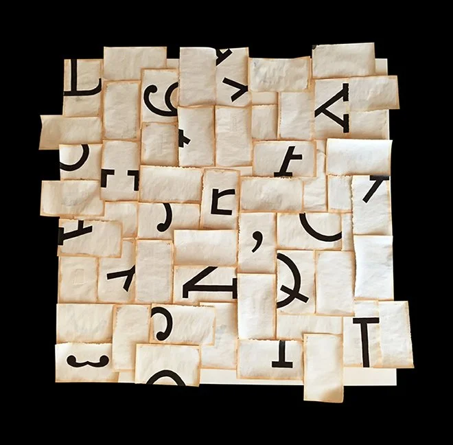
(Above) Pages of painted book pages in position before they were glued down.
I remember being in a lot of creative discomfort making that first piece. The imposter syndrome was ever-present, and the scale was especially intimidating, so I approached the composition with tiles of book pages that felt more manageable. That way, I could move pieces of the puzzle around to figure out what it wanted to become. I integrated typography into the piece because typography was something that I understood. Usually typography serves as an element of utility within the written word. I wanted to explore the idea of fragmented type into its parts.
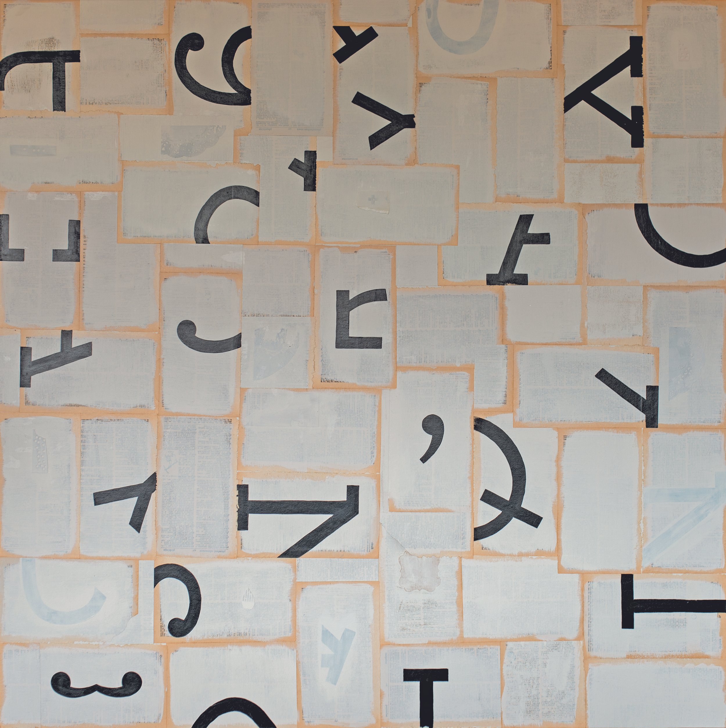
Many of us take type for granted because it magically appears on our screens. However, type designers have spent countless hours shaping letters, finessing their forms, creating exquisite curves and lines to create a single font/font family. Their attention to the thousands of details are invisible to the user, while enhancing the reader’s experience.
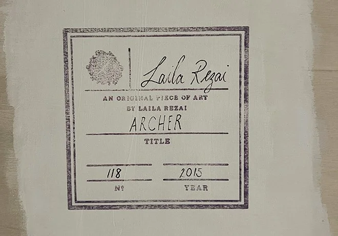
I specifically chose a slab serif font called Archer for its squared geometries, in addition to my respect for the font house and designer that created Archer. It was originally designed by Johnathan Hoefler in 2001 for Martha Stewart Living. I painted the fragmented type onto the pages of a pocket-sized dictionary that my siblings and I had shared during the 80s. I named the 36” x 36” piece Archer, in honor of the typeface.
That was in 2015, and I hung Archer in our living room. I would often walk by thinking Archer was an incomplete story. Then a few weeks ago, I decided to go back into the piece to tell the story of America as an idea, and an ideal. I focused on coding the piece with details of a democracy that is often fighting to exist.
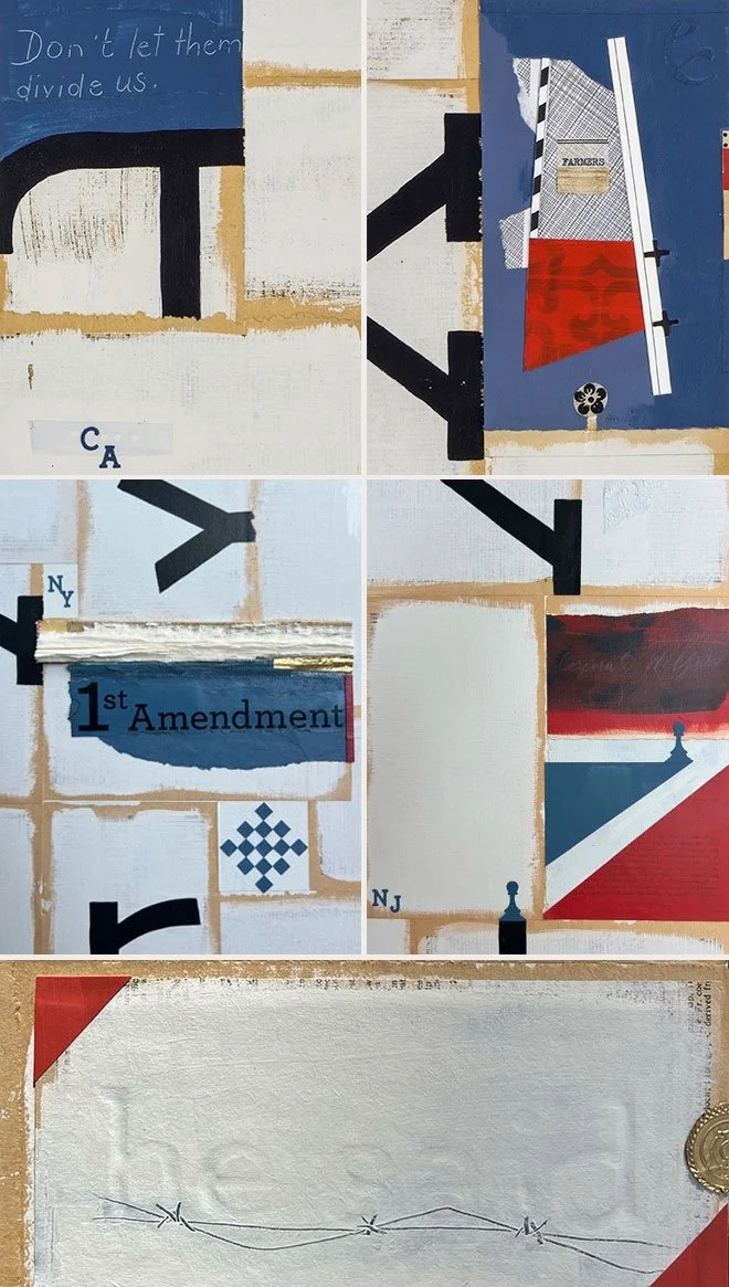
As I worked my way through the piece, it was obvious to me how quiet my voice was a decade ago, compared with how expressive I am at the threshold of 50. Both consciously and subconsciously, parts of America’s story kept intersecting my own. I included five different states in the piece (VA, GA, CA, NY, and NJ) to reflect the nation’s recent voting results. I have lived in three of the five states that I included: I grew up in Northern VA, went to art school in GA, and have lived in CA for the past 25 years. Each of those states shaped the person that I have become. A proud immigrant from Tehran, Iran who found a way of telling stories through the medium of art.
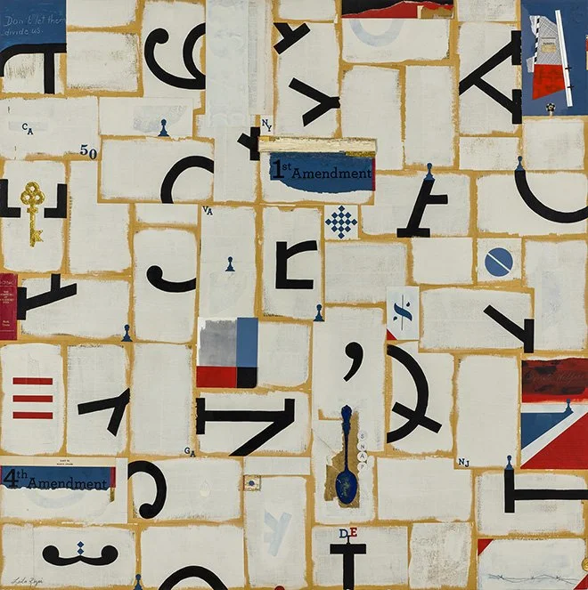
(Above) America as an Idea, America as an Ideal 36” x 36”
Collage and acrylic on wood panel | Available
